Tag: #art

  • The art of AI

    Like many new investors, few actually know how it really works. For AI, all I know is the acronym is “artificial intelligence”.

    There is a HUGE TREND amongst pretty much everyone I know (maybe everyone you know, too).

    The only get the impression (condensed, too detailed for here) is you give it a prompt, and it will give a perfect reaction based on previous linkages from the internet.

    This could be totally wrong, but basing on that judgement;

    We like what we’re good at. We LOVE for the imperfections.

    Like the odd incorrect note in a song, or the imperfections in the sound of their vices. Even the obviously wrong brushstroke in a painting. You can tell it’s done by a being with fallibilities, with emotions, with a conscious.

  • Kintsugi

    The act of Kintsugi is a Japanese way of repairing pieces of broken pottery with gold. It establishes the idea of your imperfections can make you more beautiful. What was once a broken piece of rubbish has been made into something more beautiful, & actually stronger.

    So, in my case, even though my a bit broken, the finished product will be different, but a different kind of beautiful.

  • Art

    I did something quite interesting recently, I went to an art class. The old Leuty was technically sublime (not trying to brag). & now it’s like I’m learning the technical attributes again. I drew a picture for my friend & talked to him on the phone after he received it, & he said that creatively I still have the gift. For me all the effort is in the technical aspect though.

  • Asymmetry

    What I did recently is I lost one earring, which I really regret. But I am always like to embrace being difficult, so I chose to have some asymmetrical earrings. I’ve put a couple of pictures of each ear.

    I think they’re both from the same brand (or they both look aesthetically similar).

    The only problem is I know a lot about the acetylcholine one but nothing about the other one.
    Here’s is the other , a-symmetrical one on my left tar with my ugly keloid scar (which I am definitely going to do a post about cause they’re really interesting & basically no one knows about them)
  • Ray Harryhausen

    This is just a review of what I saw at the GMA today. It was a retrospective of Ray Harryhausen’s work, & he really changed the culture of the process of how films are made. It showed a run through of how he actually did his well. For you who don’t know who he was he made the process of start-stop animation (think how Wallis & Gromit are animated). He served in WW2 but then introduced stills of pop, so got teenagers more interest in film. You could try out how they did it, where they had a bunch of layers, a background & camera so the background looked like it had a monster on it, & you were appearing in front of it.

    Just for some context his work is probably best portrayed in “jason and the argonauts”

    I went with my 2 nieces, & I know that they had a lot of fun, but some activities seemed to be very child friendly. It really did make me more aware of his work & appreciate his work. So, I can’t recommend it more, see it now at Scottish National Gallery of Modern Art (also known as Modern T).

  • Parra!

    Or otherwise known as Piet Parra was another collaboration I just remember.

    The fact that the fabric with Piet Parra’s prints where signed off with a simple “Parra!”

    I really like his work now & think I probably did before I lost my memory, so because I want to share the joy, I’ll share his work with you here, & hope you like it as much as I do.

    The more I research his work, the more it seems familiar. How annoying.

  • Romance

    Ok, this post isn’t about romance per se, but about a piece of work you’ll like, which is called “Romance”

    This is definitely an interesting collaboration, the work of Chris Craymer & a season by Mulberry.

    Me & my career we’re having a conversation & the subject of romance was touched. I don’t know why but I remembered this Chris Craymer project called “romance “ & I remembered I really liked it; it’s so humerus, but still witty.

    So to promote this collaboration, Mulberry used a lot of diversity in terms of models. it’s a good example of fashion expanding its horizons, making its brand more diverse.

    Just an example is that Tommy Hilfiger doing a collection for disabled people, you should check it out, it’s called “Adaptive”.

    On that subject a billion people globally that’s about 15% of the population are disabled in one way or another, so fashion should be the diversity rail laser.

    And some of the most common aspects of fashion design are inaccessible to people with certain disabilities.

    In this time of this collection, more brands have focussed on the issue of diversity. Even down to the small details like bigger zippers on zippers for hands that shake.

  • 16/6 – Tattoos

    A tattoo is life long. You have to be absolutely sure about it. You can’t just take it off.

    I, myself, have 3 tattoos & there was a lot of thought put into them. I’m writing this blog post because my new passion project is designing a tattoo. My 3 ones are on the soul of my foot, because that’s where tatattoos should be, on your soul. I appreciate the play on words.

    The first two ones I got, still on my soul, the placement was where your heart is in reflexology (on my heart & soul).

    A foot tattoo is easy to hide, so if you’re like me, having a mum who is very anti-tattoo then they’re easily hidden. She only found out about my tattoos when I was in a coma. So I guess I dodged a bullitt there.

    What my tattoos are are that 2 are the Greek symbol for the golden section, & 1 is a lightning bolt. The bolt because I love the energy of lightning & the mix of physics & nature. & lightning leuty I guess, there’s a ring to the alliteration. The symbol of the golden section is the last because it’s a mathematical theory for beauty. It is scattered all over the art world too. I love that there is a theory of where art & beauty cross will mathematics.

  • 11/5- Tattoo design

    11/5- Tattoo design

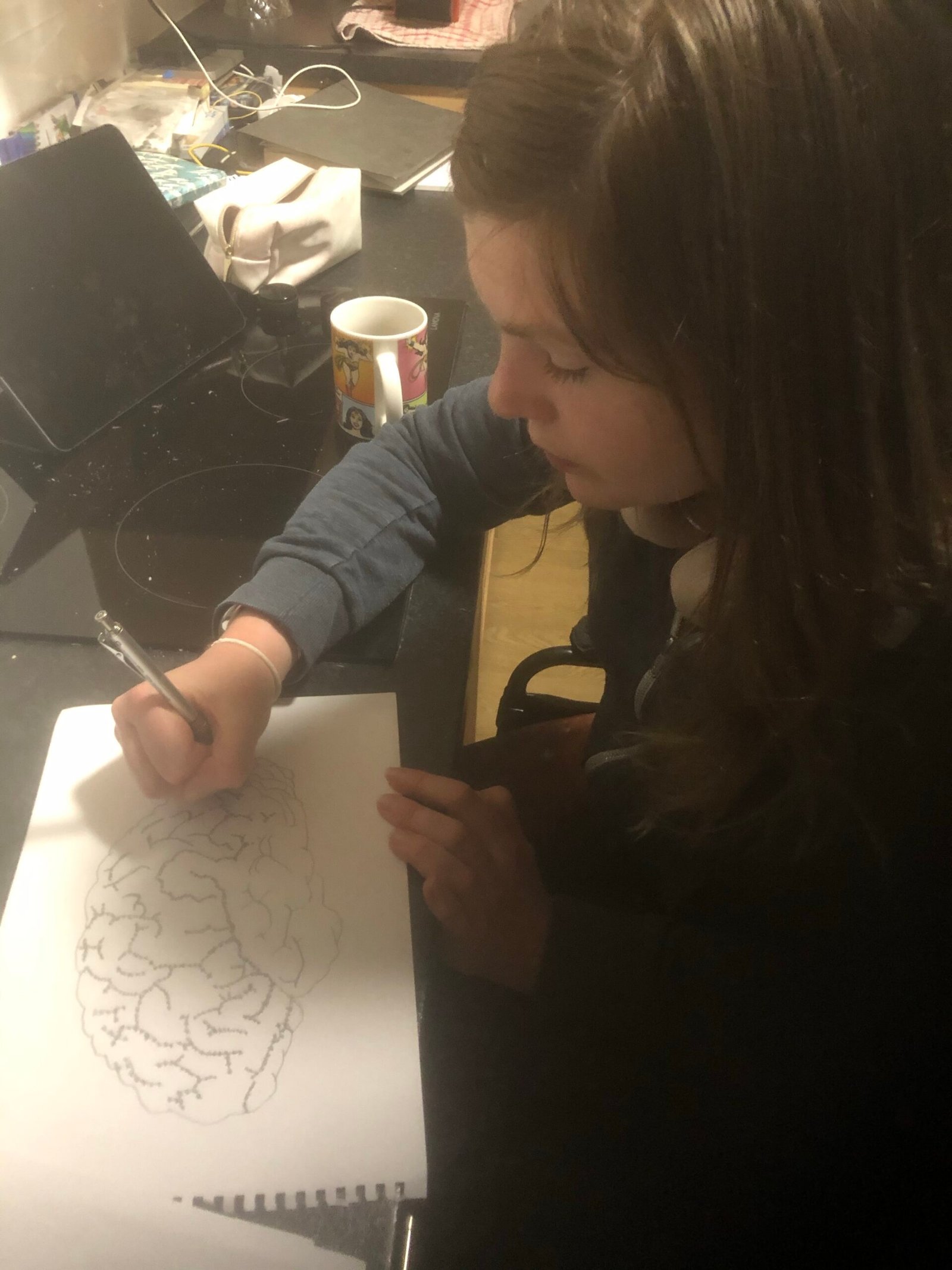
    I have a brand new project which really tickles my fancy. That is designing a tattoo!

    The person who it’s for gave me very little to work from.

    He’s looking after me , while I’m recovering from this brain injury, so I was thinking maybe a brain could be a symbol.

    He speaks 3 languages, fluently. I have highlighted the Wernicke’s & Broca’s areas, both of which are focused on language.

    He wants it to be on his arm so I guess it’ll be relatively small.

    Maybe a philosophical thing could be that instead of line, they will be stars so it kind of makes a constellation. It also is kind of saying that the brain, like the stars, is infinite.